
To achieve striking and immersive images, mastering the art of color manipulation in Photoshop is essential. It requires a high level of skill in creating harmonious color schemes. Additionally, having a keen sense of color perception and a solid understanding of the fundamental principles of color mixing is crucial. By skillfully applying these techniques, your photographs can transform into captivating and vibrant visual experiences.
In the forthcoming article, I will provide a concise overview of the fundamental color mixing techniques in Photoshop, covering both the basics and more advanced skills. I invite you to follow along with the article below as we delve into the world of color manipulation.
1. Introduction to color system - color mixing technique in photoshop
If you have ever dabbled in image editing software, understanding the color system is fundamental knowledge. A color system refers to a model that involves blending colors within the system to produce new colors within the visible light spectrum. Currently, the two most widely used and basic color systems are RGB and CMYK.
CMYK is an acronym for Cyan, Magenta, Yellow, and Key (black). When these three colors, Cyan, Magenta, and Yellow, are combined in equal proportions (1:1:1), the result is black (known as the key color).
On the other hand, RGB represents the three primary colors: Red, Green, and Blue. When these three colors are mixed in equal proportions (1:1:1), the outcome is white.

The CMYK color system serves as the fundamental color model ideal for printing and design purposes, including posters, brochures, catalogs, and magazines. On the other hand, the RGB color system is a foundational three-color model that generates a wide range of colors within the visible light spectrum. It is particularly well-suited for presentations displayed on computer screens, phone screens, and other digital devices.
1. About color schemes
As ColorMe introduced, there are 6 basic ways you can mix a color scheme for your design:
– Monochromatic (monochromatic color scheme)
– Analogous (Similar color scheme)
– Complementary – Contrast color scheme
– Split Complementary – Triangle color scheme/ Isosceles triangle color scheme
– Tetradic – Rectangular color scheme
– Square – Square color scheme
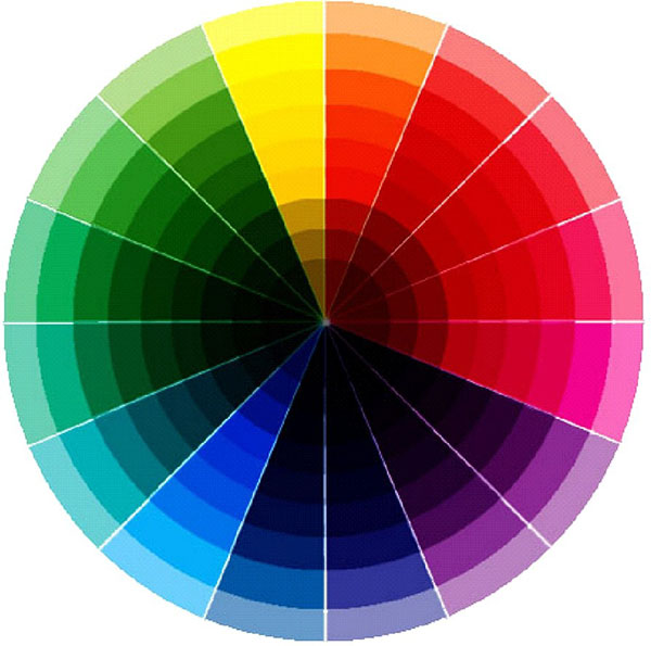
 Source: lifehacker.com
2. Synthesize principles and techniques of color mixing in Photoshop
1. Color mixing technique in photoshop – monochromatic color scheme
The monochromatic color scheme involves the use of a dominant color or various shades of the same color. This approach creates a sense of harmony and elicits a pleasant feeling for the viewer. However, it can sometimes pose challenges when attempting to highlight specific details in a product due to the inherent uniformity of the monochromatic palette.
Monochromatic color schemes are frequently employed in minimalist design styles. This technique allows viewers to remain undistracted by other elements and instead focus solely on the central element. Additionally, the monochromatic color scheme is often utilized to enhance the sharpness and impact of simple typefaces, making them more visually striking.
Principles of color scheme in design – monochromatic color scheme
2. Color mixing technique in photoshop – similar color scheme
The analogous color scheme involves the harmonious combination of colors that are adjacent to each other on the color wheel, typically consisting of three colors. This approach creates a sense of elegance and beauty, resulting in visually appealing color combinations. Compared to the monochromatic color scheme, the analogous scheme offers a greater variety of colors, making it easier to differentiate between different elements on a product. The colors used in an analogous scheme are located next to each other on the color wheel, eliminating complexity or confusion.
When working with an analogous color scheme, it is common to select a dominant color. This color serves as the primary hue and other colors should complement and harmonize with the dominant color. The second color is then chosen to highlight important information or elements within the product. Finally, the designer may incorporate a third color for decorative details or additional visual interest.

Principle of color scheme in design – similar color scheme
3. Principle of color scheme in design – direct complement
The color wheel provides a valuable resource for skillfully and effectively utilizing symmetrical color pairs to create new, unique, and visually appealing colors, known as complementary colors. By strategically employing complementary colors, important details can be emphasized and made more impactful.
However, it's important to note that the direct complementary color scheme may not be suitable for products with a light and entertaining style. When implementing this scheme, it is advisable to choose a dominant color and then select symmetrical colors as secondary hues. It is best to avoid using desaturated colors as they can diminish the contrast and vibrancy of the color pairs.
4. Color mixing technique in photoshop – complementing the trio
The triadic color scheme is often regarded as a reliable and straightforward approach to color coordination. This scheme involves the use of three colors positioned at different corners of the color wheel, forming an equilateral triangle. These three colors combine harmoniously, complementing each other and creating a balanced visual effect for the product.
However, it is worth noting that the triadic color scheme can sometimes appear monotonous, subdued, and safe. If you aim to create a standout element in your product, implementing the complementary color scheme within the triadic scheme can be challenging. Nevertheless, some individuals appreciate this color scheme precisely because it captures customers' attention and directs it towards the product.
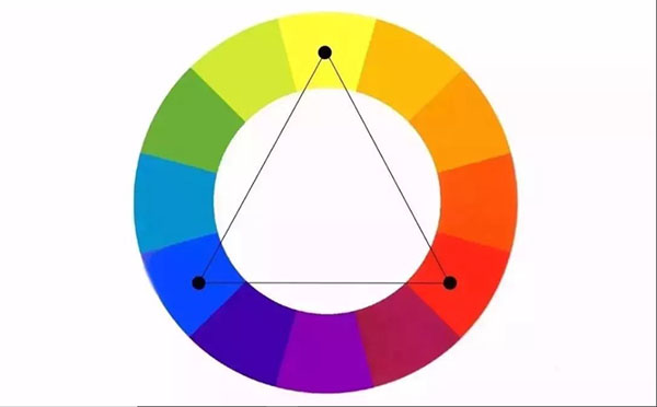
The principle of color scheme in design – complementing the trio
